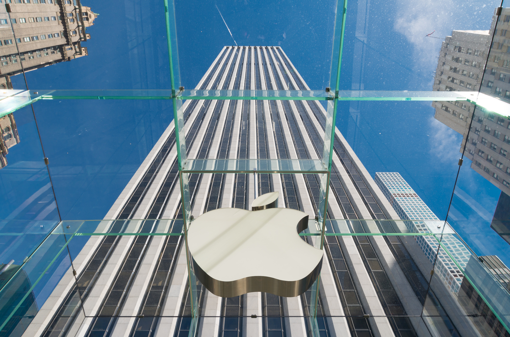
The Apple logo is one of the most recognizable in the world. While many see the golden arches of McDonald’s as the most iconic logo ever it is slowly being overtaken by the apple with a single bite. The story and evolution of the Apple logo are as simple and profound as the image itself, read on to find out.
The name of the computer company, of course, came before the image. Steve Jobs chose to call the company Apple because it was simple and sophisticated, like the computers he wanted to sell. He also made reference to how the apple was the “fruit of creation” and how he had a particular fondness for the fruit.
When it came to the logo design, at first Apple did not choose simplicity. The first logo for Apple Computer Co. was an image of Issac Newton sitting under an apple tree. A clear reference to the monumental discovery of gravity. The image was overlayed with the company name and surrounded by a quote from William Wordsworth “Newton… a mind forever voyaging through strange seas of thought”. As the logo evolved the quote would not survive but is amazing to look back at now as we marvel at the seas of thought that Steve Jobs must have voyaged through to create such disruptive products as the iPod, iPhone, and iPad.
It did not take long for the logo to evolve either. Within a year Jobs had opted for the minimalistic apple we are familiar with today. Jobs approached Rob Janoff, a graphic designer who created the now-famous logo.
The original design was slightly different from today’s version. It had multicolor stripes across the apple as a reference to Apple offering the first computer with a color display. It also lacked the symmetry of today’s Apple logo. This was because Janoff lacked the same digital tools that are available today. In 1984 it received a slight tweak in symmetry and has had 4 versions of color since its inception. Today we all know it as the sleek chrome Apple. Who knows what the future holds for the company and logo that changed so much in the last twenty years.


