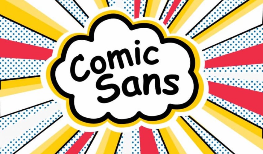
You can tell a lot about a person by the type of font they use. If you are of the older generation you may be a fan of times new roman, if you are more conservative you may be a fan of Georgia, if you are a little more playful you may like Trebuchet. Who are you if you like Comic Sans? The font has been around for over 20 years and has been overused so much that the sight of it alone can turn people away from whatever information is being presented.
The man to blame for the creation of Comic Sans is Vincent Connare. Connare worked at Microsoft at the time and was tasked with creating a font for Microsoft Bob. The program was launched in 1995 and Comic Sans was not chosen. Microsoft Bob was designed to be more user-friendly and make things easier to understand on Microsoft. The Comic Sans font was designed to playful and calming. Microsoft Bob was short-lived, it was binned early in 1996.
Despite Comic Sans not being chosen for Microsoft Bob, it appeared in the default office programs of Windows since then. While Bob is now long extinct, Comic Sans lives on. Connare was a fine arts student before joining the real world. He found the best art was that which stood out from the rest. In designing Comic Sans that was his aim. He based the typeface on comic books at the time and showed it to his bosses. Some were not impressed with it as it lacked the typography of other fonts. It was too loose, lacking form. Yet, according to Connare, that was the whole purpose.
Today Comic Sans is used all around the world, and to put it plainly it is used too much. It is used as a passive-aggressive font when people want to tell you something bad without wanting to seem rude, “DO NOT ENTER”. It is used for signs, it is used for business logos, it wouldn’t surprise us if it has even been used for a gravestone at this point. Please help us in reducing the overexposure of Comic Sans. Use it wisely.